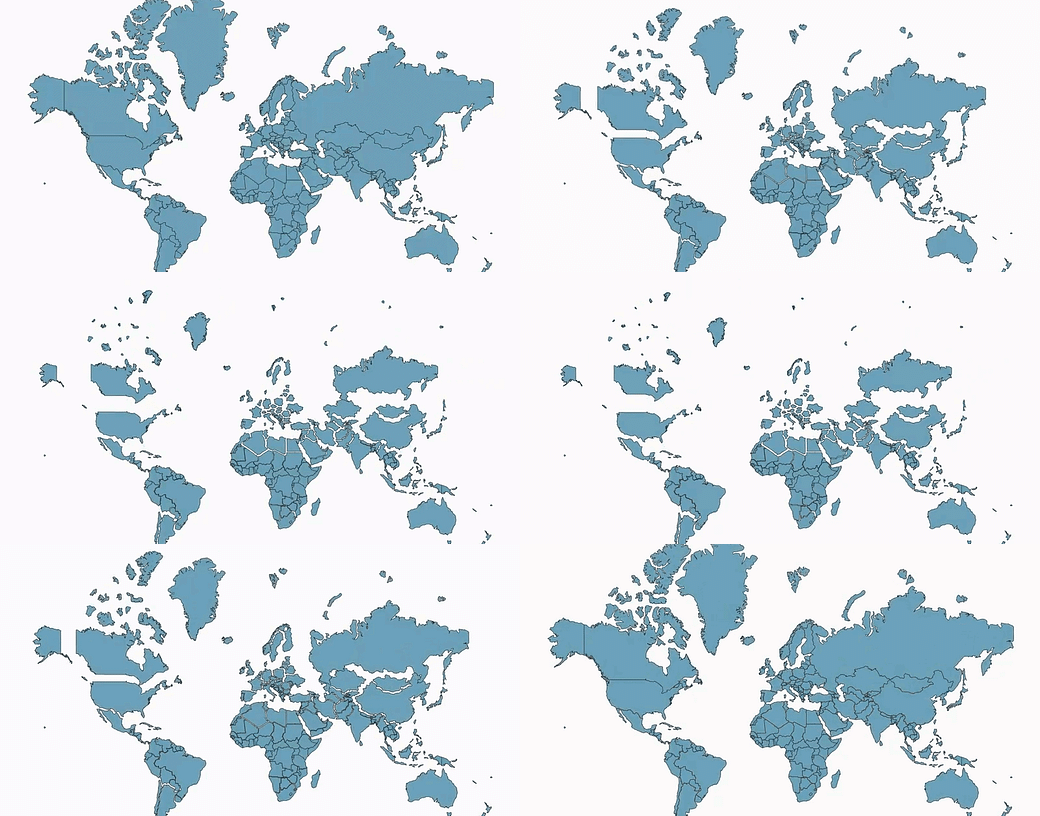
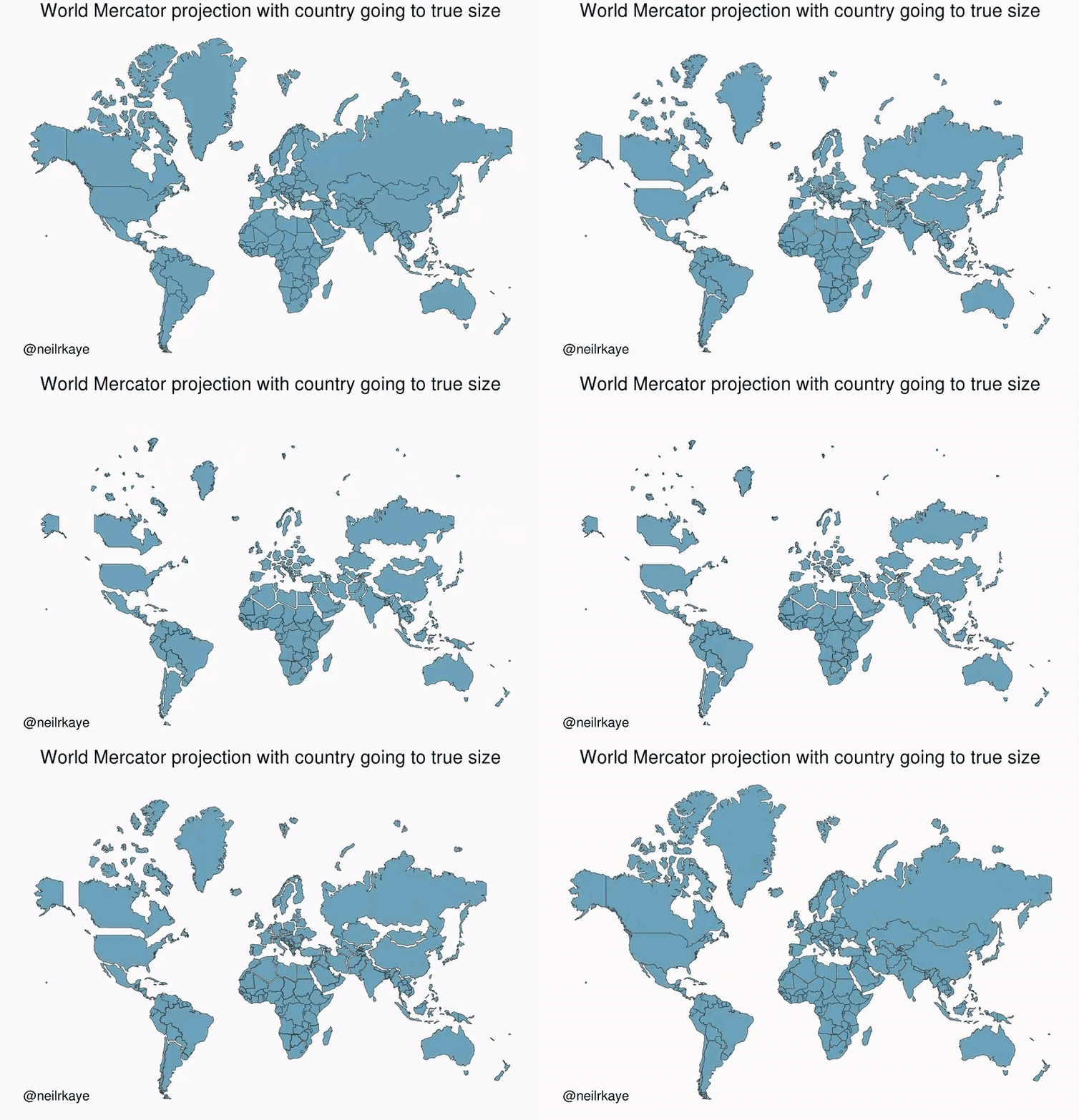
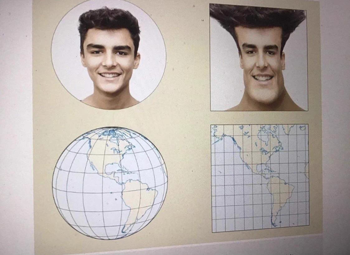
Maps twist our perception of the world. More specifically, the Mercator projection, which is what is commonly used, distorts certain countries completely.
Countries closer to the equator (i.e. poorer) seem smaller than they really are
So we develop a weak intuition for comparing country sizes.
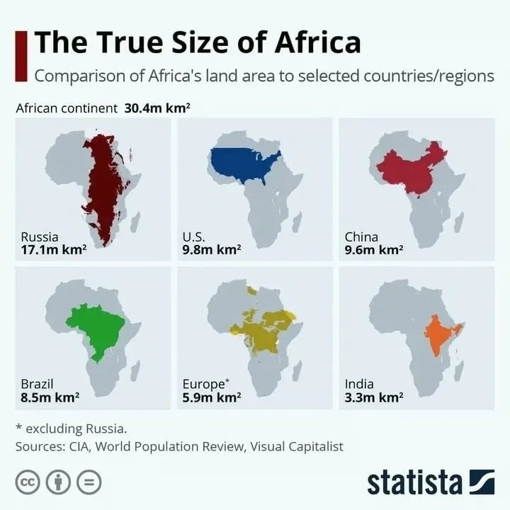
The biggest loser is Africa, which is humongous in reality.
Brazil is so big, the northernmost point of the country is closer to ALL North American countries than to the southernmost point in Brazil!
Click the ❤️ on top if you enjoyed this post. New here? Subscribe now to MuchCurious- now read by more than 172,000 smart, curious folks!
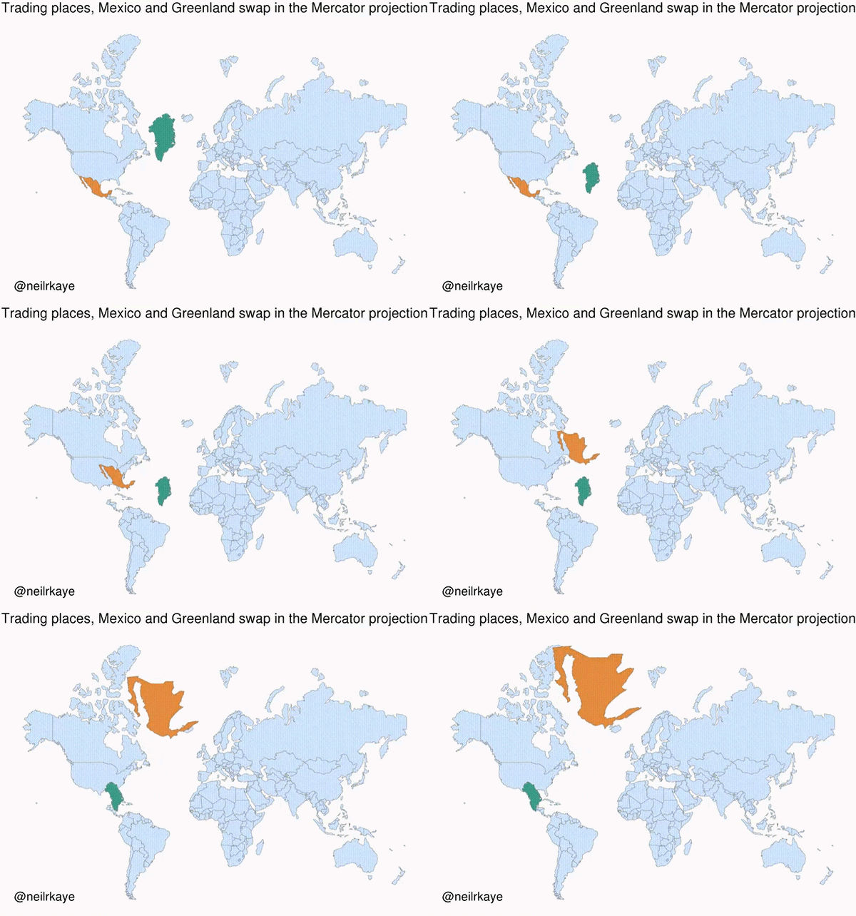
Hasn’t Greenland always looked so large and dominating on the map? This is Mexico swapping places with Greenland.
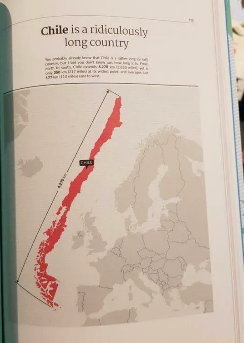
Fun fact - Chile is as long as Europe!
Why does this happen? Because the Earth is spherical- flattening a ball distorts its shape completely!
Found this post interesting? You might like our previous posts. And if you’re reading this online, subscribe to the newsletter - its free!




Amazingly well presented. Whoa - I have coded geo maps for my product with the default mercator - but never thought of this !!
Woah!!!